In dpSpatial there are approximately 20 different kinds of drawing attributes that can be applied to the components, e.g. different color settings, dimensions, scale interval, fonts, designs and styles. All the component types that has a graphical presentation has different drawing attributes that can be adjusted. In the table below a description of the different component types are displayed.
Component typ |
Description |
Example |
Graphical representation |
|---|---|---|---|
Text |
Text graphic in the map view and schema. |
Label, free text |
Yes |
Graphic |
Lines, polygons |
Referens line, unpostable line |
Yes |
Symbol |
Point with related graphics |
Filled polygons |
Yes |
Raster |
Raster image with corner coordinates and URL. |
Satellite image |
Yes |
Data |
The primary component for the object. Non graphical information. |
Object type ID, terminal data |
No |
All drawing attributes are not available for all component types. There are common drawing attributes that you can adjust for two or more component types. An example is the color settings which can be edited on all component types except the raster components. The drawing attributes for Scale from and Scale to however, is available for all the component types including raster.
Other drawing attributes are own, i.e. they can only be applied on an unique component type. Examples of own drawing attributes are a text style that can only be adjusted on a text component. Another example is Width in pixels, which is a drawing attribute that the symbol component owns.
Common and own drawing attributes
Drawing attributes |
Component type |
|||
|---|---|---|---|---|
Scale from |
Symbol |
Text |
Graphic |
Raster |
Common |
||||
* |
* |
* |
* |
|
Scale to |
* |
* |
* |
* |
Draw order |
* |
* |
* |
* |
Initially visible |
* |
* |
* |
* |
Line color |
* |
* |
* |
|
Fill color |
* |
* |
* |
|
Line width |
* |
* |
* |
|
Line width in meter |
* |
* |
* |
|
Line style |
* |
|
* |
|
Fill style |
* |
|
* |
|
Height |
* |
* |
|
|
Minimum pixel height |
* |
* |
|
|
Maximum height in pixels |
* |
* |
|
|
|
Own |
|||
Symbol font |
Font |
|
|
|
Symbol ID |
Justification |
|
|
|
Width in meters |
Text style |
|
|
|
Minimum width in pixels |
|
|
|
|
Maximum width in pixels |
|
|
|
|
In the following tables a description of all the available drawing attributes are displayed, both common drawing attributes and those drawing attributes which only exists for symbol and text components. In the occurring case a standard value is set for the drawing attribute. A component is assigned to a standard attribute automatically as soon as the component is included in a product either by that:
•the component exists in a product class, which can be connected to a product, or
•the component is added to a product class, which is already connected to one or several products.
Common drawing attributes
Drawing attribute |
Description |
||||||||||||||||||||||||||||||
|---|---|---|---|---|---|---|---|---|---|---|---|---|---|---|---|---|---|---|---|---|---|---|---|---|---|---|---|---|---|---|---|
Scale from |
Scale factor from which the component should be visible.
Standard attribute: 0. |
||||||||||||||||||||||||||||||
Scale to |
Scale factor to which the component should be visible.
Standard attribute: 2000. |
||||||||||||||||||||||||||||||
Draw order |
Specifies where in z-direction components should be drawn. Components with low draw order values are drawn in background layers in the map view, and components with high draw order values in foreground layers. Thus, components with high draw order values may overlap components with low draw order values. Standard attribute: 0 For recommended draw order values for maps, map objects and components, see section Recommended draw order values. |
||||||||||||||||||||||||||||||
Visible |
Is set in the drop-down list with the values Yes, No or NULL (empty field value). A component with the drawing attribute Visible, where the attribute is set to No, will automatically be hidden or not visible in the graphical view.
Standard attribute: Yes (visible). |
||||||||||||||||||||||||||||||
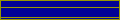
Line color |
Drawing color for line graphics, border lines and hatching (patterns) in filled areas.
Standard attribute: Black. |
||||||||||||||||||||||||||||||
Fill color |
Fill color on filled areas like polygons and symbols.
Standard attribute: Black. |
||||||||||||||||||||||||||||||
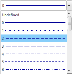
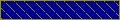
Line style |
Drawing style for lines. Select a line style by using the drop-down list:
Standard attribute: 0
|
||||||||||||||||||||||||||||||
Line width in pixels |
The thickness of a line measured in number of image points or pixels. The given pixel value for a line is a limiter for the given line width in meter. In order for the representation of a line with a wanted width of 1 meter should remain real in the map view, it takes a higher pixel value the smaller the map scale that is used.
Standard attribute: 1.
Note! That if user-defined line styles exists, the values for line width and line width in meter, will not be drawn. Those fields remain gray (=not editable). |
||||||||||||||||||||||||||||||
Line width in meter |
The line thickness measured in meter, depends on the degree of zooming in. The standard value is -1 which gives that the drawing in the map view always is controlled by the line width in pixels.
Standard attribute: -1.
Note! That if user-defined line styles exists, the values for line width and line width in meter, will not be drawn. Those fields remain gray (=not editable). |
||||||||||||||||||||||||||||||
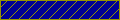
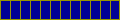
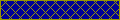
Fill style |
Fill style and hatching of closed areas and symbols are set by using a drop-down list:
|
||||||||||||||||||||||||||||||
Height |
The height measured in meters. Standard attribute: 1. |
||||||||||||||||||||||||||||||
Minimum height in pixels |
The minimum allowed height in pixels, regardless of scale. Standard attribute: 0. |
||||||||||||||||||||||||||||||
Maximum height in pixels |
The maximum allowed height measured in pixels, regardless of scale. Standard attribute: 0. |
Own drawing attributes: symbol components
Symbol drawing attributes |
Description |
||
|---|---|---|---|
Symbol font |
The name on a symbol library. |
||
Symbol ID |
The name of a symbol in a symbol library.
|
||
Width |
The width measured in meters. Standard attribute: 1. |
||
Minimum width in pixels |
The minimum allowed width in pixels, regardless of scale. Standard attribute: 0. |
||
Max width in pixels |
The maximum allowed width measured in pixels, regardless of scale. Standard attribute: 0. |
Own drawing attributes: text components
Text drawing attributes |
Description |
|||||||||||||||||||||||||
|---|---|---|---|---|---|---|---|---|---|---|---|---|---|---|---|---|---|---|---|---|---|---|---|---|---|---|
Font |
The text font. The font is set by a numeric value. If no value is set, the standard font for the system will be used (Arial). |
|||||||||||||||||||||||||
Justification |
Justification of the text location. A drop-down list with nine values are used to set the justification points (also attachment point/anchor point) in relation to the placement of the text. See illustration below for an example:
Example: A text justification (6) Top center has a justification point that exists straight above the text. Application: A text can be rotated around its justification point. Standard attribute: 2 (bottom left). |
|||||||||||||||||||||||||
Text style |
Formatting of texts. Is set by using a drop-down list with predefined values: ▪Undefined ▪Default (Default attribute) ▪Bold ▪Italic ▪Bold/Italic ▪Halo |
Size in pixels or meters
You can choose whether to specify drawing attributes in pixels or meters. The most common is to use pixels. This ensures that the size of the object on the screen is the same no matter how you zoom in the map.
If you only want to use pixel values, set Width in meters to -1.
Meter width is used to prevent a line from becoming too wide when you zoom out. Increasing the pixel width will make the line wider when zoomed in, but it will never be wider than the specified width in meters.
|
If you use a custom line style (strokes.conf), you cannot set the width, it is predefined in the line style. |
Text attributes
For text, you can set the Height in meters and also limit the text size with pixel values.
If you set the Height in meters and leave the pixel values at 0, the text size follows the map scale. The text gets bigger when you zoom in and smaller when you zoom out.
Setting Minimum height in pixels and/or Maximum height in pixels limits the size of the text on the screen:
•Minimum height keeps the text from getting too small when you zoom out.
•Maximum height keeps the text from getting too big when you zoom in.
Symbol attributes
For symbols, you can specify the Height and Width in meters and also limit the symbol size with pixel values.
If you specify Height and Width in meters and leave the pixel values at 0, the symbol size follows the map scale. The symbol gets bigger when you zoom in and smaller when you zoom out.
Setting the Minimum Height in pixels and/or Maximum Height in pixels limits the size of the symbol on the screen:
•Minimum height keeps the symbol from getting too small when you zoom out.
•Maximum height keeps the symbol from getting too big when you zoom in.
•If you set the same value for min and max, the symbol will always be the same size in pixels.